Azure DevOps

Course announcement: FlowViz Fundamentals

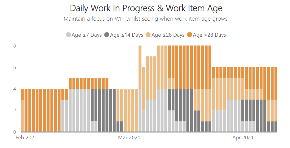
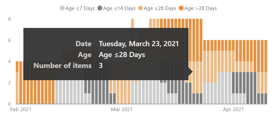
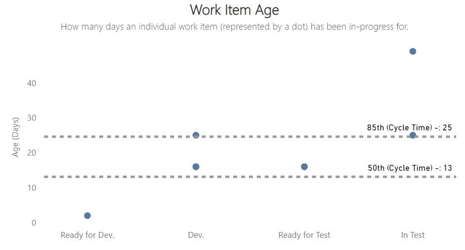
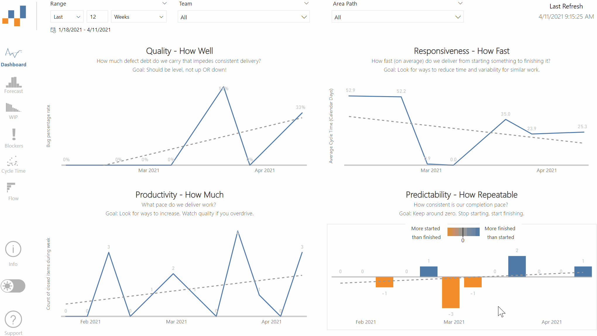
FlowViz is a free data visualisation template for Power BI that allows you to better visualize flow metrics from the data your teams’ Kanban board generates in Azure DevOps, Azure DevOps Server, TFS or GitHub Issues. The chart contains industry recognised flow metrics (Throughput, Work In Progress, Cycle Time, Work Item Age) as well as probabilistic forecasting/Monte Carlo Simulation for answering “when will it be done” or “what will we get”. It is inspired by the work of many leaders in our field, such as Larry Maccherone, Troy Magennis, Dan Vacanti and Prateek Singh. 

Since launching in 2019, it has been downloaded hundreds of times and continues to be one of the most popular tools in the marketplace for flow metrics. 

I'm pleased to announce the next iteration of the product: FlowViz Fundamentals course.

FlowViz Fundamentals provides a comprehensive overview of every chart within FlowViz, detailing how they are calculated, what to look for in the charts, exercises where you have different teams' charts presented and you have to observe what you can identify, as well as follow on videos where I explain what the patterns/anti-patterns are.

The course is online and self-study, allowing you to go at your own pace and contains over 50 videos for you to work through. No additional downloads are needed, with all the videos and example exercises (with sample data) built into the course.

April FlowViz Updates

With one more weekend till the UK starts to reopen and us starting to move back towards normality, I again used some free time over the weekend to scratch some creative itches when it comes to FlowViz. 

Daily Work In Progress & Work Item Age

Increasingly I’m learning more and more through the #DrunkAgile series that teams focusing on WIP alone is not enough. Work Item Age should increasingly play a part in the importance of teams process/workflow. I started to tackle this in the previous release however I started to think more about what could be done in the visuals within FlowViz. I’ve also long loathed the Agile community’s love of Cumulative Flow Diagrams (CFDs) - yes I know they can show you your bottlenecks and can be used as a learning aid with Little’s Law, but I’ve found through experience that they’re simply not practical. In the past five years I would say I’ve experienced a 10:1 ratio of people who don’t get CFDs versus people who encourage and advocate their usage. This felt like a good time to remove it from the template and focus on something better, something more insightful, creative and actionable.

Daily WIP and Work Item Age.png

I got most of the inspiration for this visual (like most things in the Agile Data/Metrics world!) from Troy Magennis. He’s used something very similar in his team dashboard for a while, and given the data I needed was already there in Azure DevOps OData API it was pretty easy to do.

Daily WIP and Work Item Age2.png

This chart shows both the number of items in progress on a given date, as well as highlighting how old those respective items are. The chart groups the item age into ≤7 days, ≤14 days, ≤28 days and >28 days in progress. It allows teams to analyse two key factors when it comes to stability of flow in your system, helping them both maintain optimising WIP (factor one) and seeing when the age of open work grows (factor two). Teams should try to balance how high the bar is (WIP) and how orange the bars are (Age).

Information Panel

I’ve invested quite a bit of team into creating quite a thorough Wiki for anyone who downloads FlowViz. However I find most people tend to like to just download and figure it out for themselves. I recently watched a Guy in a Cube video where Adam showed a pretty cool way to create an information panel for your report. So I decided to do something similar!

Guide.gif

Now, even if people don’t make it to the Wiki, there is a small button that at least can help them if they do get stuck on any of the pages. It was pretty simple to make, just using Google Slides and ensuring transparent backgrounds were there. 

Screenshot 2021-04-10 at 22.00.45.png

The hard part was working it all into the existing bookmarks however, once I got in a rhythm it didn’t take too long. Check it out and let me know your thoughts!

Other Minor Updates

I also managed to rattle through some minor bug fixes, mainly fixing the board column order in the Work Item Age chart and paying off some tech debt in removing unused columns, changing formulas and reducing date ranges for certain queries. The Wiki has also been updated with various new screenshots and I’ve also added some guidance for TFS (I know!) users into the Wiki FAQs, as someone DM’d me on the Azure DevOps Club Slack group asking for help getting setup.
Finally, I’ve moved to experimenting with using the kanban board within GitHub for ideas on both new features and to give people a bit more insight as to what is being worked on or coming soon. Not quite there in keeping it updated but getting there :)  

Screenshot 2021-04-10 at 22.57.49.png

Anyway, the new version is now available - please use the GitHub repo or Azure DevOps Marketplace to download the latest version.

If you have any ideas yourself I’d love to hear them in the comments below or via the Discussion page on GitHub.

New FlowViz Features

As my new role involves Jira as our main workflow visualisation tool and Thoughtspot as our analytics platform, I don’t get as much time these days to build on functionality of FlowViz for Azure DevOps. However, as we near (hopefully) the end of lockdown in the UK, I used some free time over the past few weekends to make a number of new changes to the report.

Work Item Age

I was never quite happy with how this chart looked previously. Whilst I accept it was pretty easy to read, I don’t believe taking action off work item age *alone* (most likely always looking at the oldest) is sufficient. You need to see where it sits in the workflow to help aid that conversation. For example, if you swarmed/prioritised something with a high work item age that is relatively left in the workflow, say ‘In Development’, this may not be the right thing to do if you have lots of items with a lower work item age that are close to ‘Done’.

The new version of this chart helps provide a clearer picture of the workflow and all the items, hopefully allowing you to make more informed decisions. Each dot represents an item (items with the same age and same column overlap). Hovering on a dot reveals the work item ID, title, the date it was started and the days in progress so far.

WIP Age2.png

Daily Work In Progress (WIP)

This was a revert back to an old chart. The previous version would show average WIP per week which, whilst helpful, could easily mask some problems with flow in your system. You could easily have really high WIP on Monday and Tuesday, but much lower in the subsequent days, which could mean you have a system falling foul of the ‘flaw of averages’. Whilst this may seem fine, I can’t see how an environment where you’re always starting your week trying to do lots of things at once is a healthy/enjoyable culture!

WIP Per Week.png
Screenshot 2021-03-13 at 17.15.37.png

The new version now shows daily WIP, as well as retaining the trend-line. I also went with a stepped chart rather than a line chart as I believe this better highlights changes in increases/decreases in WIP.

Blocked Work

No actual change to the visuals here, just a back end/data loading one. Previously, the only way to get blocked data was to use tagging when items were blocked, then removing tags once unblocked. After a couple of requests via the Azure DevOps Club Slack channel, you now can also get the benefits of this data if you use an inherited process and add the Blocked field to the work item form. 

One thing to call out here is that if you do both (I’m not sure why you would?) of these approaches to identifying blocked work, your numbers will come out crazy, as it will double count. Unfortunately there is no workaround for this, so if you do want to use these visuals, make sure you’re consistent in your approach to blocking work!

Cycle/Lead Time Scatter Plots

I’ve made a few tweaks to this one - the first main change being reducing the size of the dots. The previous scatter plot was hard to read (using the ‘out the box’ dot size) if you had lots of ‘done’ items.

Cycle Time Scatter.png

I’ve also now managed to tackle the issue if multiple items finish on the same date with the same cycle/lead times by showing larger ‘dots’. The more items that have the same details, the larger the dot. A new version of the tooltip also means that you can see what these multiple items are and the associated details around work item ID, date they were ‘done’ and exact cycle time.

Cycle Time Scatter2.png

The final tweak was to remove the legend as given there is a legend in the line charts above showing the average cycle/lead time I felt this was wasted real estate on the report.

Azure DevOps Server Support

Finally, there is now a working version for Azure DevOps Server. Again this came via the Slack channel, where Vincent Quach offered tonnes of help in getting it setup for his organisation. As I don’t have a test Azure DevOps Server and didn’t have the time to set one up, his assistance in validating what I built was much appreciated. So for any folks out there who have longed for this in Azure DevOps Server - now you can use it!

Final thoughts

I’m always on the lookout for inspiration and new ideas when it comes to what can be visualized in FlowViz. Typically these come at random times, so I use the Notes app in my iPhone to jot them down.

Some current ideas I’ve yet to explore include:

  • One template that can cover all use cases instead of the four templates currently 

  • Ability for scatter plots to highlight any items that were ever blocked

  • Use of Power BI anomalies to highlight ‘strange’ weeks and possible reasons

If you have any ideas yourself I’d love to hear them in the comments below or via the Discussion page on GitHub.

Please use the GitHub repo or Azure DevOps Marketplace to download the latest version!

Test Traceability Reporting for Azure DevOps

Recently I’ve been trying to see what testing data you can get out of Azure DevOps. Whilst there tends to be sufficient reporting available out the box, I do feel the ability to do aggregated reporting is somewhat lacking. Specifically, I was interested in looking at how to get an overview of all Test Plans (and a breakdown of test cases within it) as well as looking at how you can get some form of testing ‘traceability’ when it comes to Product Backlog Items (PBIs). This in particular harks back to the ‘old days’ when you used to have to deliver a Requirements Traceability Matrix (RTM) to ‘prove’ you had completed testing, showing coverage and where any tests had passed/failed/not run/blocked etc. It wouldn’t be my preferred choice when it comes to test reporting but there was an ask from a client to do so, plus if you can provide something people are used to seeing to get their buy in with new ways of working then why not? So I took this up as a challenge to see what could be done.

Microsoft’s documentation has some pretty useful guidance when it comes to Requirements Tracking and how to easily obtain this using OData queries. One major thing that’s missing in the documentation, which I found out through this process and raising in the developer community, is that this ONLY works when you have test cases that you’ve added/linked to a PBI/User Story via the Kanban board. Any test cases that have been manually linked to work items simply will not appear in the query, potentially presenting a false view that there is a “gap” in your testing 😟

Thankfully, I went through the frustration of figuring that out the hard way and changed the original OData query to pull in more data, template it as a .PBIT file so others don’t have to worry about it. What I have now is a Power BI report consisting of two pages.
The first consolidates the status of all my Test Plans into a single page (within Azure DevOps you have to go through each individual one to get this data) with a table visual. This will show the status of test cases within the test plan, whether it be run / not run / passed / failed / blocked / N/A - in both count and percentage. The conditional formatting will highlight any test cases blocked or failed, with the title column being clickable to take you to that specific test plan. 

Picture1.png

The second page in the report was the key focus, which shows traceability of tests cases to PBI’s /User Stories and their respective status. I could have added the number of bugs related to the PBI’s/User Stories however I find teams are not consistent with how they handle bugs, so this might be a misleading data point. Like I said, this ONLY work for test cases added via the Kanban board (I added a note at the top of the report to explain this as well). Again, the conditional formatting will highlight any test cases blocked or failed, with the title column being clickable to take you to that specific test plan. 

Picture3.png

Finally, both pages contain the ‘Text Filter’ visual from App Source, meaning if you have a large dataset you can search for either a particular test plan or PBI/User Story.

Picture2.png
Picture4.png

The types of questions to ask when using this report are:

  • How much testing is complete?

  • What is the current status of tests passing, failing, or being blocked?

  • How many tests are defined for each PBI/User Story?

  • How many of these tests are passing?

  • Which PBIs/User Stories are at risk?

  • Which PBIs/User Stories aren't sufficiently stable for release?

  • Which PBIs/User Stories can we ship today?

Anyway, I hope it adds some value and can help your teams/organisation.
Templated in my GitHub repo, leave a like if this is would be useful or comment below if you have any thoughts or feedback.

I’m considering creating a few of these, so would be great to here from people what else would help with their day to day.