The second in a three-part series on moving away from Story Points and how to introduce empirical methods within your team(s).
Part one refamiliarised ourselves with what story points are, a brief history lesson and facts about them, the pitfalls of using them and how we can use alternative methods for single item estimation.
Part two looks at probabilistic vs. deterministic thinking, the use of burndown/burnups, the flaw of averages and monte carlo simulation for multiple item estimation.
Forecasting
You’ll have noticed in part one I used the word forecast a number of times, particularly when it came to the use of Cycle Time. It’s useful to clarify some meaning before we proceed.
What do we mean by a forecast?
Forecast — predict or estimate (a future event or trend).
What does a forecast consist of?
A forecast is a calculation about the future that includes both a range and a probability of that range occurring.
Where do we see forecasts?
Everywhere!
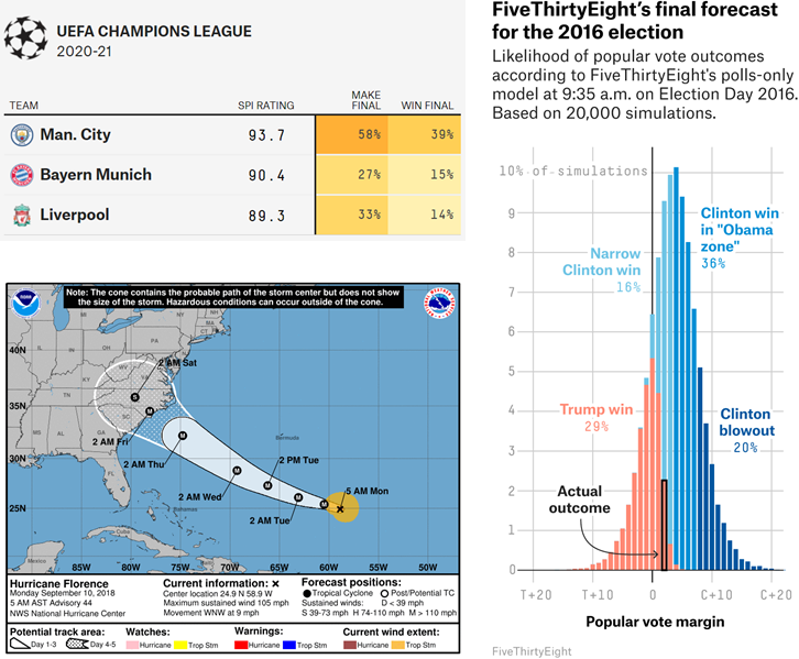
Sources: FiveThirtyEight & National Hurricane Centre
Forecasting in our context
In our context, we use forecasting to answer the key questions of:
When will it be done?
What will we get?
Which we typically do by:
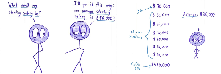
Which we then visualize as a burnup/burndown chart, such as the example below. Feel free to play around with the inputs:
https://observablehq.com/embed/@nbrown/story-pointless?cells=viewof+work%2Cviewof+rate%2Cchart
All good right? Well not really…
The problems with this approach
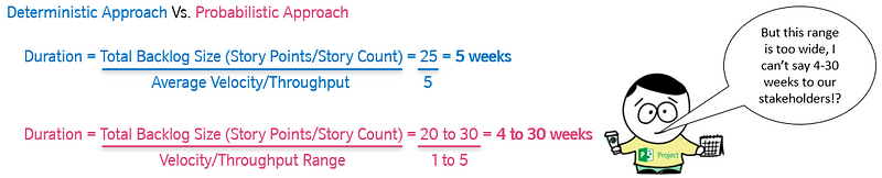
The big issue with this approach is that the two inputs into our forecast(s) are highly uncertain, both are influenced by;
Additional work/rework
Feedback
Delivery team changes (increase/decrease)
Production issues
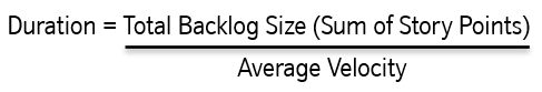
Neither inputs can be known exactlyupfront nor can they be simply taken as a single value, due to their variability.
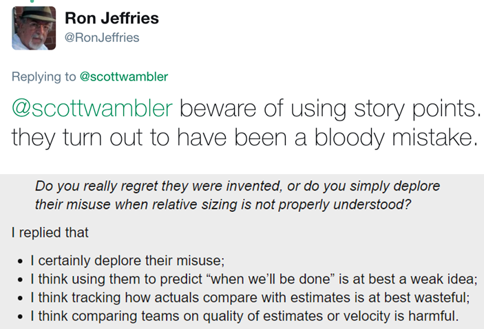
And don’t forget the flaw of averages!
Plans based on average, fail on average (Sam L. Savage — The Flaw of Averages)
The above approach means forecasting using average velocity/throughput which, at best, is the odds of a coin toss!
Source:
Math with bad drawings — Why Not to Trust Statistics
Using averages as inputs to any forecasting is fraught with danger, in particular as it is not transparent to those consuming the information. If it was it would most likely lead to a different type of conversation:
But this is Agile — we can’t know exactly when something will be done!?!…
Source: Jon Smart — Sooner, Safer, Happier
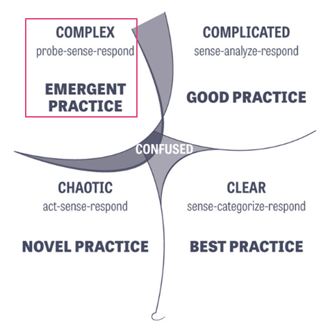
Estimating when something will be done is particularly tricky in the world of software development. Our work predominantly sits in the domain of ‘Complex’ (using Cynefin) where there are “unknown unknowns”. Therefore, when someone asks, “when will it be done?” or “what will we get?” — when we estimate, we cannot give them a single date/number, as there are many factors to consider. As a result, you need to approach the question as one which is probabilistic (a range of possibilities) rather than deterministic (a single possibility).
Forecasts are about predicting the future, but we all know the future is uncertain. Uncertainty manifests itself as a multitude of possible outcomes for a given future event, which is what science calls probability.
To think probabilistically means to acknowledge that there is more than one possible future outcome which, for our context, this means using ranges, not absolutes.
Working with ranges
Communicating such a wide range to stakeholders is definitely not advisable nor is it helpful. In order to account for this, we need an approach that allows us to simulate lots of different scenarios.
The Monte Carlo method is a method of using statistical sampling to determine probabilities. Monte Carlo Simulation (MCS) is one implementation of the Monte Carlo method, where a real-world system is used to describe a probabilistic model. The model consists of uncertainties (probabilities) of inputs that get translated into uncertainties of outputs (results).
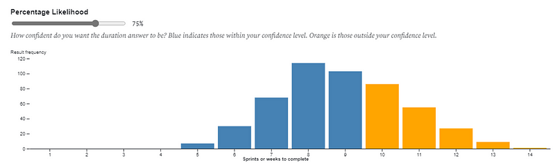
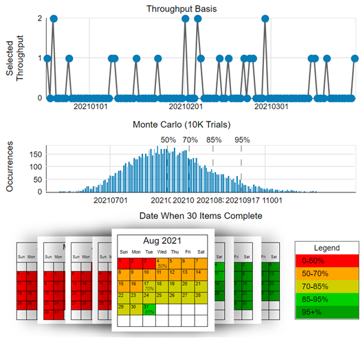
This model is run a large number (hundreds/thousands) of times resulting in many separate and independent outcomes, each representing a possible “future”. These results are then visualised into a probability distribution of possible outcomes, typically in a histogram.
TLDR; this is getting nerdy so please simplify
We use ranges (not absolutes) as inputs in the amount of work and the rate we do work. We run lots of different simulations to account for different outcomes (as we are using ranges).
So instead of this:
https://observablehq.com/embed/@nbrown/story-pointless?cells=viewof+work%2Cviewof+rate%2Cchart
We do this:
However, this is not easy on the eye!
So what we then do is visualise the results on a Histogram, showing the distribution of the different outcomes.

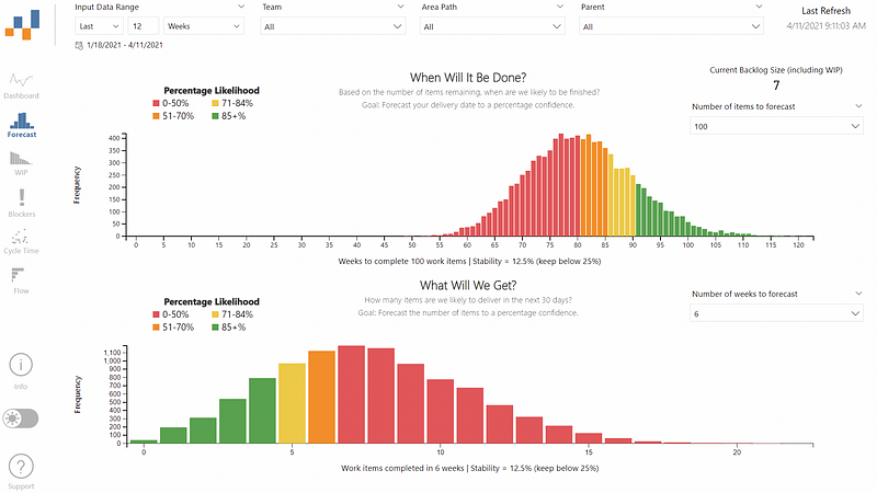
We can then attribute percentiles (aka a probability of that outcome occurring) to the information. This allows us to present a range of outcomes and probability of those outcomes occurring, otherwise known as a forecast.
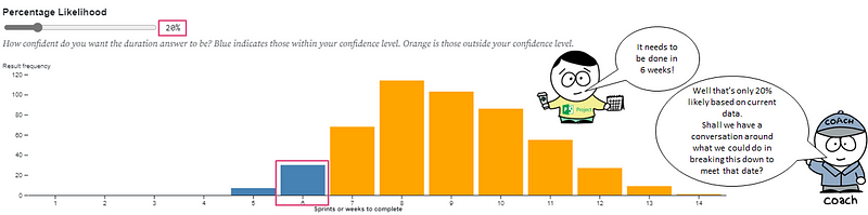
Meaning we can then move to conversations like this:
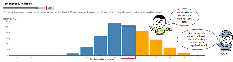
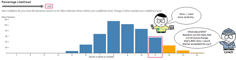
The exact same approach can be applied if we had a deadline we were working towards and we wanted to know “what will we get?” or “how far down the backlog will we get to”. The input to the forecast becomes the number of weeks you have, with the distribution showing the percentage likelihood against the number of items to be completed.
Tools to use
Clearly these simulations need computer input to help them be executed. Fortunately there are a number of tools out there to help:
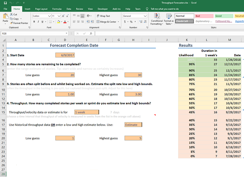
Throughput Forecaster — a free and simple to use Excel/Google Sheets solution from troy.magennis that will do 500 simulations based on manual entry of data into a few fields. Probably the easiest and quickest way to get started, just make sure you have your Throughput and Backlog Size data.
Actionable Agile — a paid tool for flow metrics and forecasting that works as standalone SaaS solution or integrated within Jira or Azure DevOps. This tool can do up to 1 million simulations, plus gives a nice visual calendar date for the forecasts and percentage likelihood.
Source:
FlowViz — a free Power BI template that I created for teams using Azure DevOps and GitHub Issues that generates flow metrics as well as monte carlo simulations. The histogram visual provides a legend which can be matched against a percentage likelihood.
Summary — multiple item forecasting
A forecast is a calculation about the future that includes both a range and a probability of that range occurring
Typically, we forecast using single values/averages — which is highly risky (odds of a coin toss at best)
Forecasting in the complex domain (Cynefin) needs to account for uncertainty (which using ‘average’ does not)
Any forecasts therefore need to be probabilistic (a range of possibilities) not deterministic (a single possibility)
Probabilistic Forecasting means running Monte Carlo Simulations (MCS) — simulating the future lots of different times
To do Monte Carlo simulation, we need Throughput data (number of completed items) and either a total number of items (backlog size) or a date we’re working towards
We should always continuously forecast as we get new information/learning, rather than forecasting just once
Ok but what about…
I’m sure you have lots of questions, as did I when first uncovering these approaches. To help you out I’ve collated the most frequently asked questions I get, which you can check out in part three…
— — — — — — — — — — — — — — — — — — — — — — — — — —