Source:
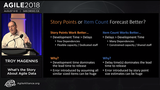
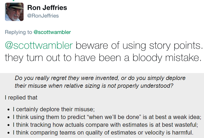
Following on from my recent Story Pointless series, I realised there was one element I missed. Think of this like a bonus track from an album, I’ll take Ludacris’ Welcome to Atlanta if we’re talking specifics. Anyway, quite often we’ll find that stakeholders are less interested in Stories, instead focusing on Epics or Features, specifically how ‘big’ they are and of course, when will they be done and/or how many of these will they get. Over the years, plenty of us have been trained that the only way to work this out is through story point estimation of all the stories within said Epic or Feature, meaning we get everyone in a room and ‘point’ each item. It’s time to challenge that notion.
A great talk I watched recently from Prateek Singh used whisk(e)y in helping provide an alternative method of doing so, distilling the topic (see what I did there) into something straight forward for ease of understanding. I’d firmly encourage anyone using or curious about the use of data and metrics to find the time to watch it using the link below:
LAG21 — Prateek Singh — Drunk Agile — How many bottles of whisky will I drink in 4 months? — YouTube
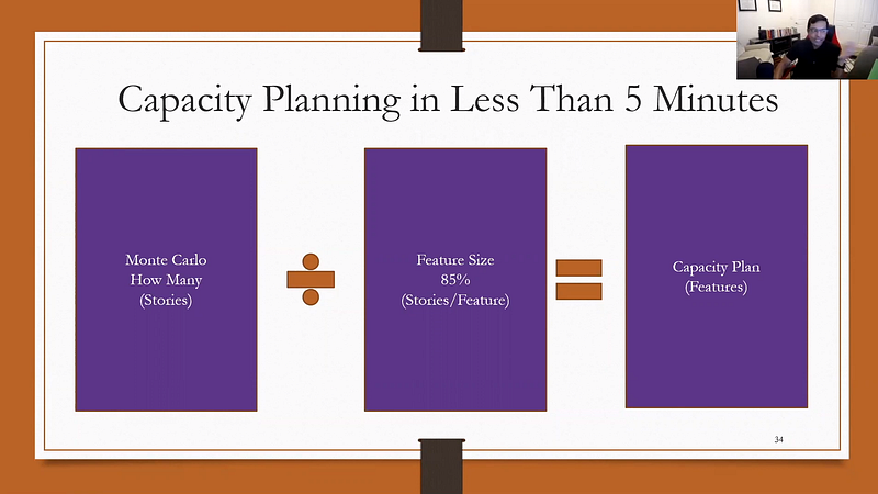
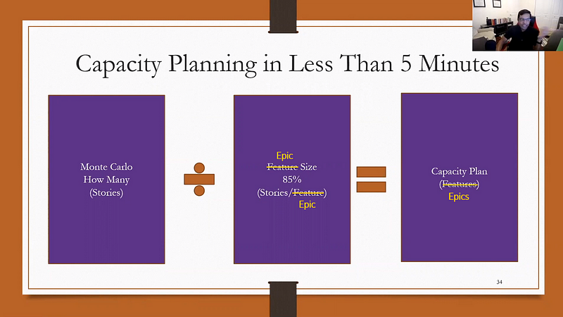
Whilst I’m not going to spoil the session by giving a TLDR, I wanted to focus on the standout slide in how to do capacity planning approach using probabilistic methods:
As you’ll know from previous posts, using data to inform better conversations is something which is key to our role at Nationwide as Ways of Working (WoW) Enablement Specialists. So again let’s use what we have in our context to demonstrate what this looks like in practice.
Putting this into practice
Before any sort of maths, we first start with how we break work down.
We take a slightly different approach to what Prateek describes in his context (Feature->Story work breakdown structure).
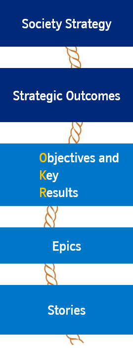
Within Nationwide, we are working towards instilling a ‘Golden Thread’ in our work — starting with our Society strategy, then moving down to strategic (three year and in-year) outcomes, breaking this down further into quarterly Objectives and Key Results (OKRs), then Epics and finally Stories.
This means that everyone can see/understand how the work they’re doing fits (or maybe does not fit!) into the goals of our organisation. When you consider the work of Daniel Pink, we’re really focusing here on that ‘purpose’ aspect in trying to instil that in everything we do.
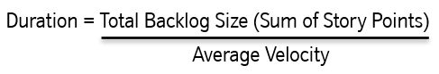
So with that in mind, we’ll focus on number of Stories within an Epic, as a replacement for Prateek’s Feature->Story breakdown. Our slightly re-jigged formula for capacity planning looking like so:
How many stories
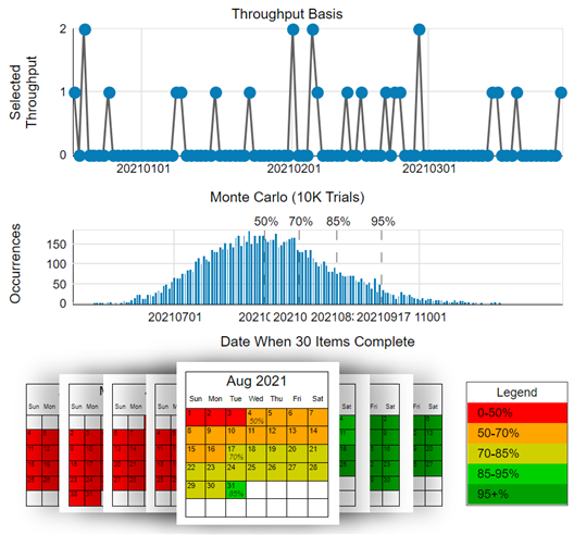
We start by running a Monte Carlo Simulation for the number of stories and the period we wish to forecast for, which allows us to get a percentage likelihood. For a detailed overview on how to do this, I recommend part two of the story pointless series. Assuming you’ve read or already understand this approach, you’ll know that to do this we first of all need input data, which comes in the form of Throughput. We get this from our ThoughtSpot platform via our our flow metrics dashboard:
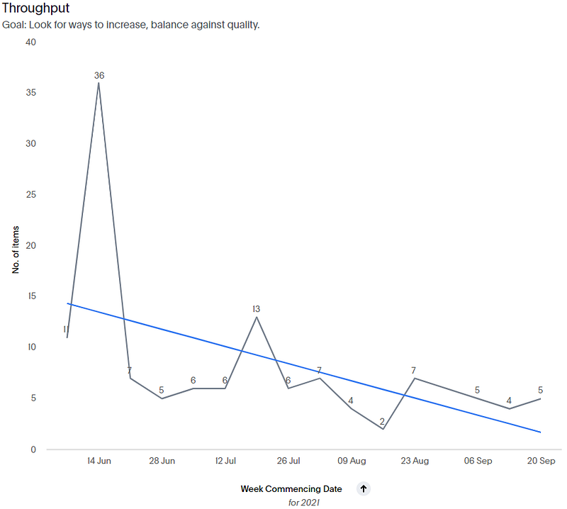
From this chart we have our weekly Throughput data for the last 15 weeks of 11, 36, 7, 5, 6, 6, 13, 6, 7, 4, 2, 7, 5, 4, 5. These will be our ‘samples’ that we will feed into our model.
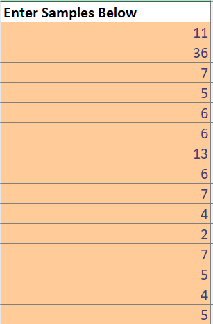
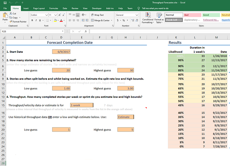
For ease of use, I’ve gone with using troy.magennis Throughput Forecaster, which I also mentioned previously. This will do 500 simulations of what our future looks like, using these numbers as the basis for samples. Within that I enter the time horizon I’d like to forecast for which, in this instance, we’re going to aim for our number of stories in the next 13 weeks. We use this as it roughly equates to a quarter, normally the planning horizon we use at an Epic level.
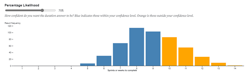
The output of our forecast looks like so:
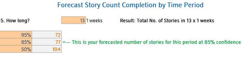
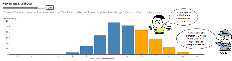
We’re happy with a little bit of risk so we’re going to choose our 85th percentile for the story count. So we can say that for this team, in the next quarter they are 85% likely to complete 77 stories or more.
Epic Size
The second part of our calculation is our Epic size.
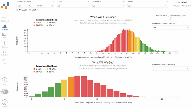
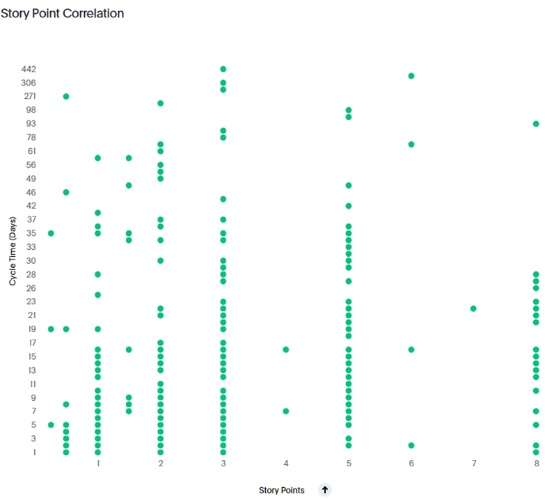
From the video, Prateek presented that the best way to visualise this as a scatter plot, with the feature sizes — that is the number of Stories within a Feature, plotted against the Feature completion date. The different percentiles are then mapped against the respective Feature ‘sizes’. We can then take that percentile to add a confidence level against the number of Stories within a Feature.
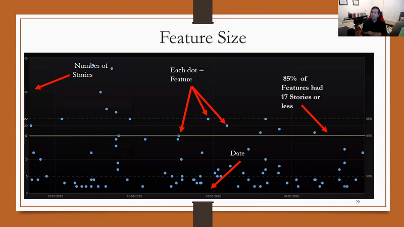
In the example you have 50% of Features with 5 stories or less, 85% of Features with 17 stories or less and 95% of Features with 22 stories or less.
As mentioned previously, we use a different work breakdown, however the same principles apply. Fortunately we again have this information to hand using our ThoughtSpot platform:
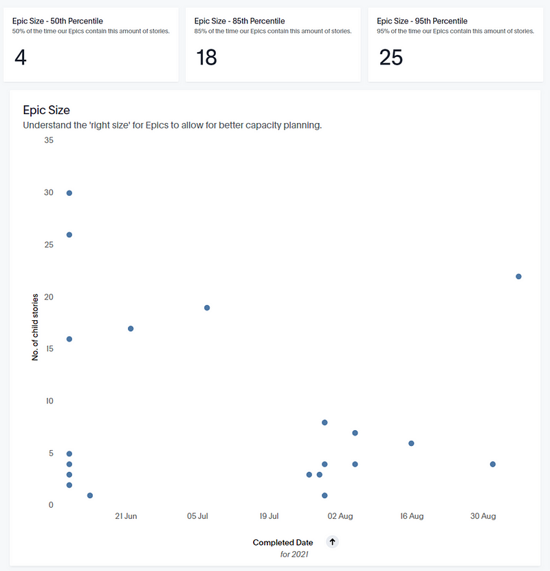
So, in taking the 85th percentile, we can say that for this team, 85% of the time, our Epics contain 18 stories or less.
Capacity Planning
With the hard part done, all we need to do now is some simple maths!
If you think back to the original formula:
How Many (Stories) / Epic Size (Stories per Epic) = Capacity Plan (# of Epics)
Therefore:
How many stories (in the next quarter): 77 or more (85% confidence)
Epic size: 18 stories or less
Capacity Plan: 77/18 = 4 (rounded)
This team has capacity for 4 Epics (right sized) in the next quarter.
And that’s capacity planning in less than five minutes ;)
Ok I’ll admit…
There is a lot more to it than this, like Prateek says in the video. Right sizing alone is a particular skillset you need for this to be effective.
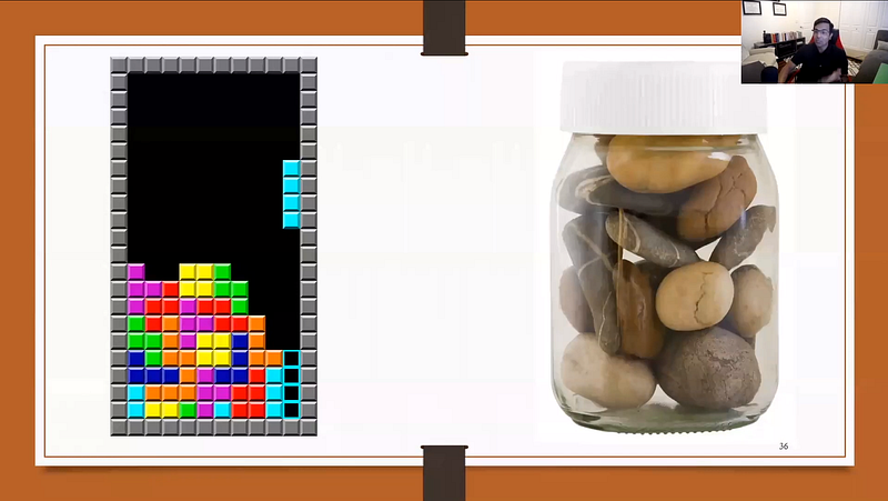
#NoTetris
The overarching point is that teams should not be trying to play Tetris with their releases, and it being more like a jar of different sized pebbles.
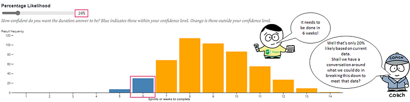
As well as this, we need to be mindful that forecasts can obviously go awry. Throughput can go up or down, priorities can change, Epics/Features can grow significantly in scope and even deadlines change. It’s essential that you continuously reforecast (#ContinuousForecasting) as and when you get new information. Make sure you don’t just forecast once and for any forecasts you do, make sure you share them with a caveat or disclaimer (or even a watermark!).
You could of course take a higher percentile too. You might want to use the 95th percentile for your monte carlo simulation (72 stories) and epic size (25), which would mean only 2 Epics. You also can use it to help protect the team —there might be 26 Epics that stakeholders want want yet we know this is only at best 50% likely (104 stories / 4 stories in an Epic) — so let’s manage expectations from the outset.
Summary
A quick run through of the topic and what we’ve learnt:
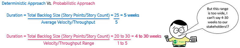
Capacity planning can be made much simpler than current methods suggest. Most would say it needs everyone in a room and the team to estimate everything in the backlog — this is simply not true.
Just like in previous posts, this is an area we can cover probabilistically, rather than deterministically. There are a range of outcomes that could occur and we need to consider this in any approach.
A simple formula to do this very quick calculation:
How Many Stories (85%) / Epic Size = Capacity Plan
To calculate how many stories, run a monte carlo simulation and take your 85th percentile for number of stories.
To calculate Epic/Feature size, visualise the total number of stories within an Epic/Feature, against the date completed, plotting the different percentiles and take the 85th one.
Divide the two, and that’s you capacity plan for the number of right sized Epics or Features in your forecasted time horizon.
Make sure you continuously forecast, using new data to inform decisions, whilst avoiding playing Tetris with capacity planning
Could you see this working in your context? Or are you already using this as a practice? Reply in the comments to let me know your thoughts :)